
Benefit Wallet
Background
The updated BenefitWallet+ app should provide an easy, convenient means for people participating in various Benefit programs to see balances on accounts as well as file claims, upload receipts, and other tasks, all from the convenience of their phones. It should provide employees with a better experience to view and manage HSA & FSA benefits. Users will update expense information confidently, rapidly & with greater ease than ever before.
Goals and Objectives
- What is the problem?
- Previously there was a UX audit of the existing app via an outside firm. From that research, several problems were identified:
- Onboarding: Log in is quick and straightforward although the navigation can be confusing. Basic instruction for new users would be useful.
- UI Architecture: App architecture is complicated and not intuitive. The interactions within the app should be familiar for the users, therefore should be based on platform-specific standards and guidelines.
- Navigation: Not all essential pages are accessible in one click. The content should be structured into logical categories, for ease of navigation.
- System Feedback: The interface should provide sufficient user feedback. It's the only way a user can understand what’s going on.But within the app, it doesn't work correctly.
- Consistency: Overall, app sticks to one style but not all interactive elements are consistent visually.
- Prioritized Features
Provided a uniform and consistent view for accessing employee benefits Increased usefulness of the application by adding more relevant information and better access to that information.
My Role and Responsibilities
- Design an experience to access the most important parts of employee benefits
- Update the UI to intuitive and provide user feedback of their actions. This process includes designing high fidelity mockups and interactive prototypes.
- Meet weekly with members of the web development team to discuss the designs and native components of the site.
- Conduct Usability Testing.
Design Iterations
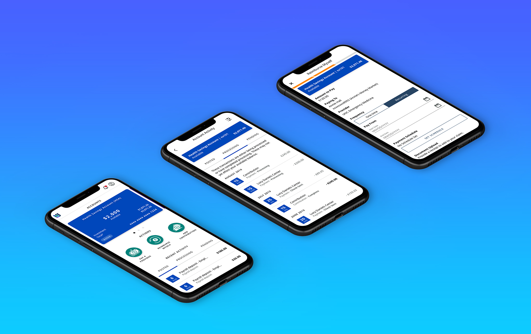
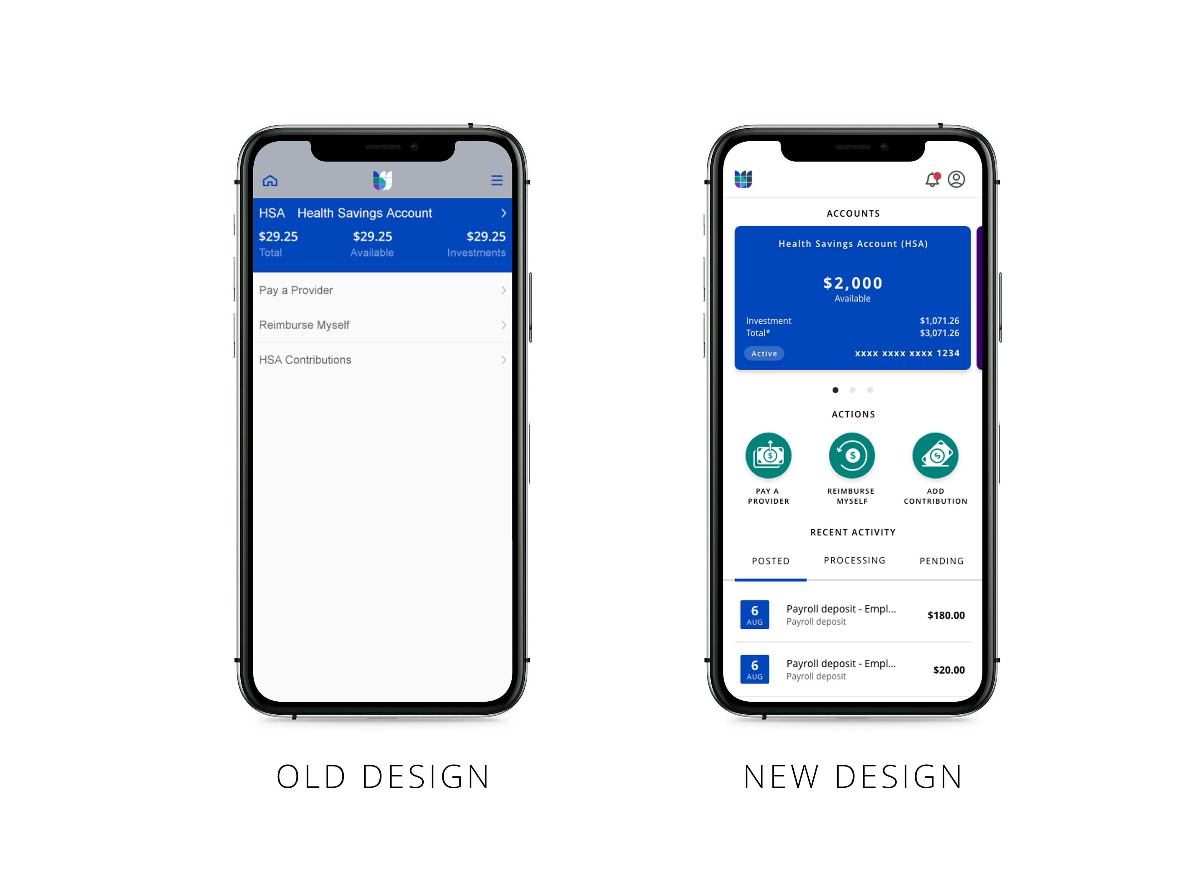
We decided that a cleaner view of the cards on the home screen would lighten up the design and also provide more individuality among the different sections of the site. This included relevant account information related to health saving account, FSA, and other account summaries.
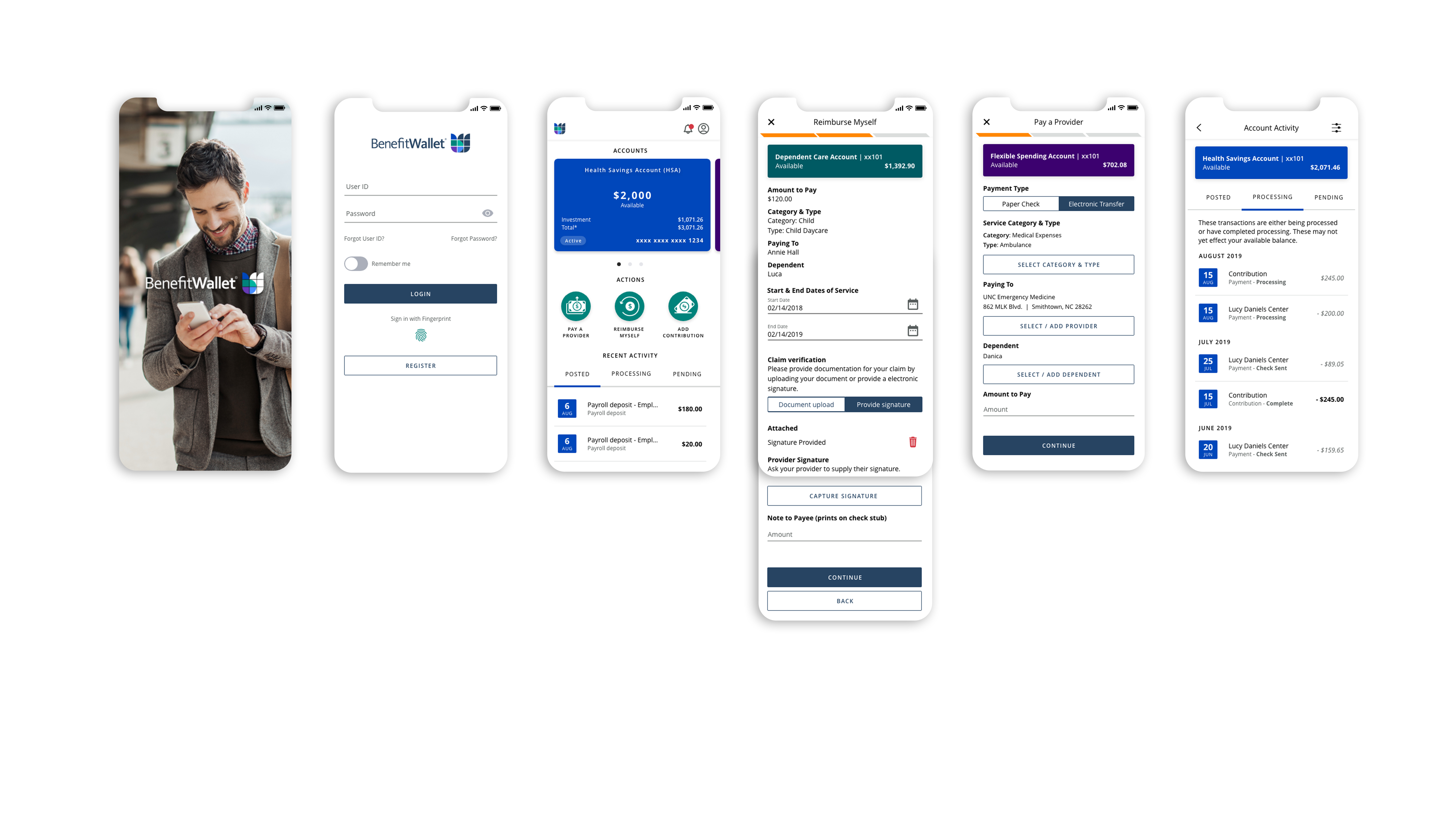
Final UI Designs
Here are the designs of some of the key screens.